Viewing options
Change in average temperature (°C)
NARCliM2.0 climate projections are also presented across timescales as side-by-side tiles and as a bar chart for the selected parameters.
Change in average temperature (ºC)
Change in average temperature (°C)
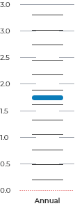
How to read this chart
The bar chart displays the outputs of each of the 10 NARCliM models averaged for the viewing options you have chosen.
The vertical length of the WHITE BAR shows the spread of values from the 10 models.
Each horizontal THIN BLACK LINE is the average for one single model for the region. There are 10 bars, one for each of the 10 models.
The THICK BLUE LINE is the average of all 10 models.
The DOTTED RED LINE represents zero change in the variable.
Download the climate snapshot and data files for NSW
You can download the NSW climate change snapshot and packaged GIS-compatible data files. To appropriately acknowledge NARCliM in your work, please see the Terms & Conditions.
Download snapshot and projection maps for NSW
Regional climate change snapshots
NARCliM Terms and Conditions of use
Data files are currently unavailable.
How to use the climate projections map
Start exploringUse the Viewing options to select the region, climate projection, time of year, time period and emissions scenario you want to explore. Use the climate projection dropdown to select the climate variable you want to view. Variables are grouped by type, such as temperature, rainfall, climate extremes and natural hazards. Start with Region under View this map by to explore average projected change across a selected region. Switch to Grid to explore local variation in projected change, shown as averages for each 4 km grid square. In Grid view, select a grid square directly on the map, or use Find address or place to find the grid square that contains that location. |
How to read this map
The colours on the map and scale bar show how the selected climate variable is projected to change from the baseline period to the selected future time period, under the selected emissions scenario.
Lighter colours show smaller projected changes. Darker colours show larger projected changes.
Some scales use one colour range to show change in one direction, such as an increase in average temperature. Other scales use two colour ranges to show change in both directions, such as projected increases and decreases in rainfall.
For percentage changes, a negative value such as -20% means the value is projected to be 20% lower than the baseline period. It does not mean the climate variable disappears.
Compare annual and seasonal projections
Use time of year to view annual or seasonal projections for the selected time period.
The map shows one time of year at a time. The tiles and chart below the map show annual and seasonal projections side by side, so you can compare projected changes across the year.
This is useful for variables with strong seasonal patterns, such as hot days of 35°C or above.
Understanding time periods and the baseline
The baseline period is the 20-year modelled average climate from 1990–2009. The map shows projected change relative to this period.
Future projections are also based on 20-year averages. In the map, these are shown as year ranges, 2020–39, 2040–59 and 2080–99.
NARCliM2.0 supporting resources may refer to these same periods by their midpoint year. For example, 2040–59 may be referred to as 2050, or “middle of the century”, and 2080–99 may be referred to as 2090, or “end of the century”.
Using 20-year averages helps smooth out natural climate variability. It avoids comparing future change with a single year that may have been unusually hot, cold, wet or dry.
About the data and how to learn more
Read the Frequently Asked Questions for answers to common questions about the interactive map and NARCliM2.0 data.
The Interactive climate change projections map uses the latest regional climate projections from the NSW and Australian Regional Climate Modelling project (NARCliM2.0). You can learn more about NARCliM regional climate projections in the Climate projections section of the AdaptNSW website.
The baseline period is modelled, not observed. Historical modelled data are evaluated against real-world observations as part of model evaluation, quality assurance and quality control.
Explore NARCliM case studies to understand how different sectors have applied NARCliM data in their work. For more supported interpretation, read the NARCliM regional climate change snapshots.
Your feedback is welcome
We’re always working to improve this website and make the information more useful.
If you have a question, suggestion or notice something that isn’t working, please let us know.