
About this case study
Increased temperatures
University and media
Advanced
The mission of the Climate Change Communication Research Hub at Monash University is ‘to build media, communication, and education programs that clearly communicate accurate, relevant climate science and solutions’.
Associate Professor David Holmes, Director of the hub, explains that their partnerships with mainstream news organisations supports a different approach to content development. He says, 'because we are partners, we pull the science into the media rather than just push a story out hoping someone will pick it up. We produce content for our media partners – we’re co-authors. We write columns that are published directly, and briefs that their journalists use.
Media organisations particularly like the visuals and data we can provide, because they don’t otherwise have access to such content. And even if they did have access and staff with the appropriate expertise on climate change, it would be time-consuming for them to analyse and visualise the data. We broker the relationship between the media and the data scientists, and make the science easy to read and understand'.
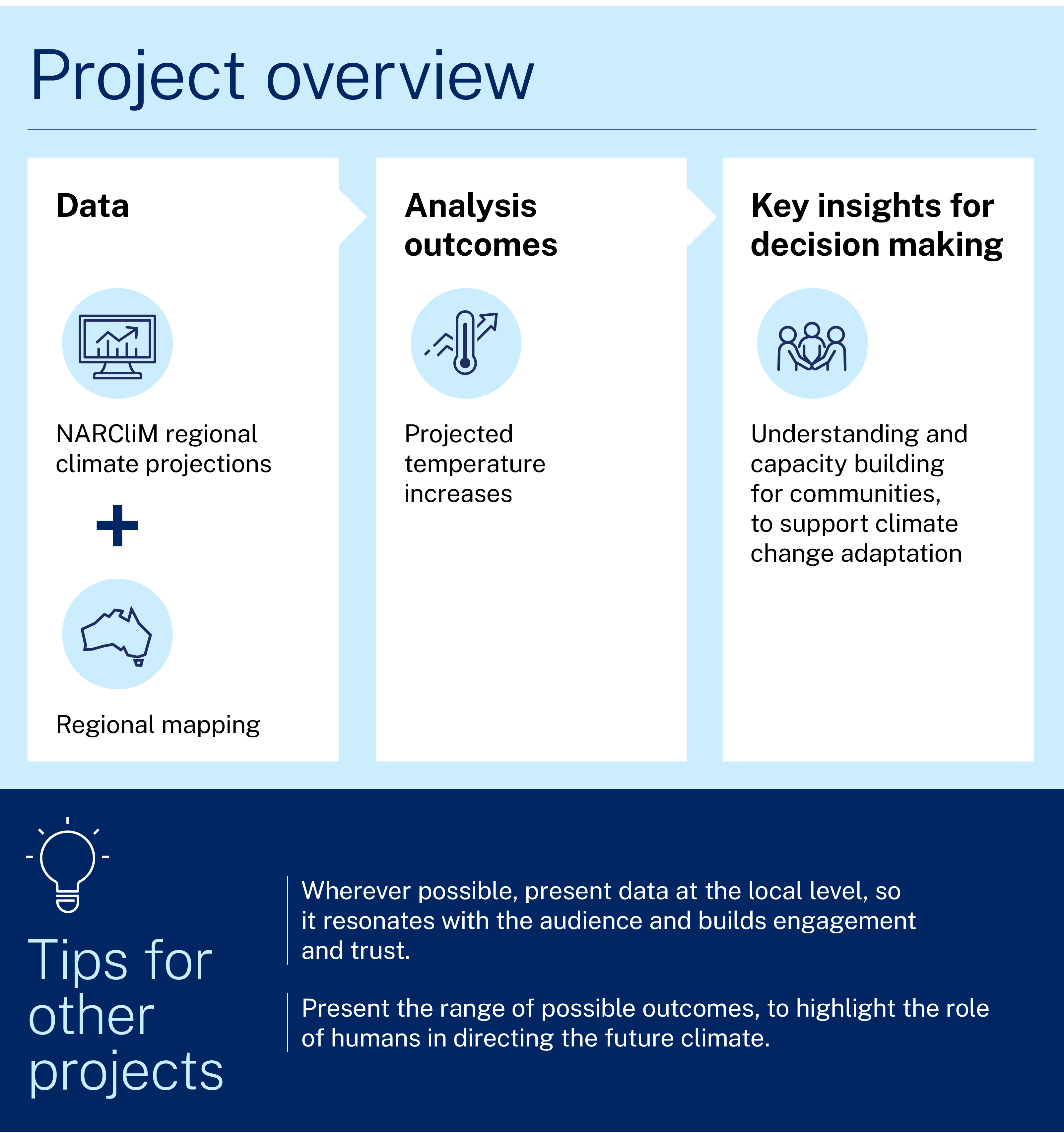
Project and outcomes
One of the main projects for the hub has been the Time is Now series, developed in partnership with news.com.au to look at the impact climate change will have on Australia by 2050. The first product for the series is an interactive map showing how many more summer days will be at least 35 °C in 2041–2060 compared with 1986–2005, for each local government area (LGA) in Australia.
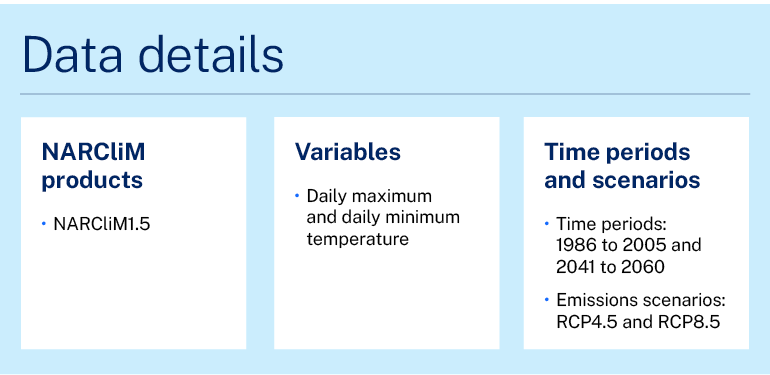
David says that the map was developed using NARCliM1.5 climate modelled data. He says:
The series was launched as part of a News Corp campaign on ‘Mission Zero’. They wanted to have the information really evidence based, so it was important that data took the lead.
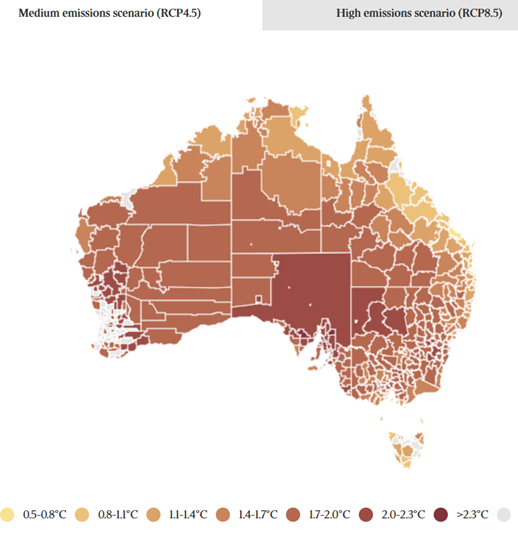
NARCliM was the most advanced dataset available, providing projections out to 2100 based on multiple Representative Concentration Pathways, or RCPs. It also provided both the coverage and the detail we needed. We looked at several other datasets, such as The Long Paddock, but they either didn’t cover all of Australia, or had a low resolution – down to a 50 km grid, compared with the 10 km grid for southeast Australia provided by NARCliM.
David explains that the local data are key to the impact of the map and other communications products:
Covering the whole country is crucial for this work.
For News Corp, it’s important because they provide news across the country. And from the science point of view, the ability to show multiple lines of evidence is the real value of this dataset. This means it’s more robust – it shows all areas that are increasing in temperature and data for each place, not just one number for the world.
But the local data and multiple lines of evidence are also very important in terms of getting our messages across. If you can communicate these to audiences, it’s a real gamechanger.
Audiences connect when the information is at a local level. They also trust the information more. They think, ‘this data is for me; the people who have produced this care about me’. With global information, people tend to think, ‘what does it have to do with me?’
From behaviour economics, we also know that being able to compare information is important for understanding. If someone can compare what’s happening in their area to what’s happening down the road or somewhere they visit, it makes it all clearer and more immediate. The interactive map brings the data to life.
The timescale provided by NARCliM was also important in ensuring that the data were relevant to people.
We have to put climate change into a timescale that people care about. For most people, anything beyond 50 years is the threshold – it’s their lifetime. If it’s 2100, they see it as not their problem. But if you set it to 2050, then they care. For example, if you talk about a sea level rise in 2100, they don’t care. But for sea level rise in 2050, people start thinking about ‘how am I going to retire to my beach house?
NARCliM provided data for a medium emissions scenario (RCP4.5) and high emissions scenario (RCP8.5). David explains that this provides messaging that is important for the public to hear.
If we only have one RCP, showing the business-as-usual pathway, it translates to advocacy – it says that this pathway is the only option. We have to show that there are other ways the movie can end.
If we only present one RCP, we also remove the anthropogenic element – we don’t see that what happens will actually depend on humans. This is part of the message. It helps put the onus on the reader – it’s over to you to help determine the future.
Learnings and considerations
The project involved 2 phases – data preparation and then data visualisation. David Hoffmann, Senior Knowledge Broker with the team, says that the data preparation process was done inhouse. It involved accessing NARCliM data from the NSW Climate Data Portal and using it in 3 climate models with 2 RCPs and 2 regional climate models for downscaling. This produced 12 outcomes with a range of potential temperatures that were processed on an LGA level, which was important for communications. He says:
Showing the range and the mean is important, because the data projections vary across the scenarios. We have to present uncertainty bands to show that there is a range of possible outcomes for future scenarios, depending on how much humans are going to change things.
It’s also important to present all the data because it builds trust – if you only present the extremes, then people can be a bit dubious. It’s important to present a range of different measures and show possible changes.
The team then worked with a data visualisation consultant to translate the data to an interactive map that would work with the News Corp platform.
David Hoffmann believes that being able to translate NARCliM data more easily would be an advantage. He says, ‘Translating NARCliM data to useful information products for small local areas does require expertise.’ Syntheses of NARCliM data analysis can be found on the AdaptNSW website in the form of regional snapshots.
David Hoffmann also highlights the value of high-resolution data. NARCliM2.0, currently in development, will offer a resolution to 4 km over southeast Australia. He says, ‘Higher resolution would also enable us to get even more local data, to enable targeted communications for specific audiences.’
Following on from the success of the first interactive map, the Monash hub team are now exploring what else NARCliM can offer. They are developing a similar interactive temperature map for spring, and will continue for different seasons. They may also look at bushfire risk, using the Forest Fire Danger Index values which are currently available for NARCliM1.0 data, and will be available for NARCliM1.5 and NARCliM2.0 data.
Case studies

The case study outlines research led by the University of Tasmania with NSW Government agencies assessing air quality improvements in the Port Macquarie public library during smoke from the 2019–2020 fires. It compared central air conditioning with portable HEPA cleaners to evaluate the library’s potential to operate as a community clean‑air shelter.

The Highlands Homegrown Economy project brought together 50 local leaders to map 20 catalytic initiatives and collaboration opportunities. By surfacing hidden projects and strengthening cross-sector trust, the process demonstrated how communities can design regenerative economies that create resilience, jobs, and shared value in a changing climate.
NSW councils are building climate risk into their business-as-usual planning and policies for the first time, thanks to products developed using NARCliM’s locally relevant climate modelled data.