Viewing options
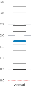
Central West and Orana average temperature 2020-39
Under the low emissions scenario (SSP1-2.6), average temperature is projected to increase by 1.2ºC by 2050 and 1.4ºC by 2090 relative to the 1990-2009 baseline.
Central West and Orana summary
Situated within the Murray-Darling Basin, the Central West and Orana region contains iconic natural landscapes including parts of the Greater Blue Mountains World Heritage area and the internationally significant Macquarie Marshes, which support a range of species including migratory birds. The landscape of the region varies, characterised by its vast plains, hills and ranges to rugged mountains and expansive woodlands. Climate change is already impacting the Central West and Orana region, particularly through increased temperatures and changes to rainfall.
How to use the climate projections map
Select the region, climate variables and timescale that you want to explore from the left Viewing menu.
Detailed Frequently Asked Questions are also available for your assistance.
The map can be viewed in a Region view or Grid view:
- In Region view you can select a region and see more information on the average value of the region for all climate variables.
- In Grid view you can see values for each 4km grid for all variables. Select a grid square to view the value of the variables for that location.
The projections data underpinning this map were developed by the NSW and Australian regional climate modelling (NARCliM) project.
Change in average temperature (°C)
- 00.5
- 1
- 1.5
- 2
- 2.5
- 3
- 3.5
- 4
- 4.5
- 5
Below you can download the snapshot and GIS-compatible data for the selected region. These projections information files are based on the NARCliM projections released in 2024.
2020-39
Change in average temperature (°C)
This Interactive map displays the plausible future climate change in NSW and ACT relative to a baseline of average climate from 1990–2009. This baseline is a modelled output and not observational data. Historical modelled data are evaluated against real-world observations during model evaluation and quality assurance and control. The presentation of data in the maps and charts is averaged across a 20-year period from the NARCliM models. The projections for 2050 represent averaged data for 2040–2059 and projections for 2090 represent averaged data for 2080–2099.
Change in average temperature (°C) chart
How to read this chart
The bar chart displays the outputs of each of the 10 NARCliM models averaged for the viewing options you have chosen.
The vertical length of the WHITE BAR shows the spread of values from the 10 models.
Each horizontal THIN BLACK LINE is the average for one single model for the region. There are 10 for each bar and do not represent a single location in the region.
The THICK BLUE LINE is the average of all 10 models.
The DOTTED RED LINE represents zero change in the variable.